Visualizations
MICOM provides a a set of visualizations that can be used with the outputs from MICOM workflows. Those visualizations are the same as provided by the MICOM Qiime 2 plugin but are delivered as single HTML files that bundles interactive graphics and raw data.
To create some more interesting figures here we will use a realistic example data set which is the output of running the MICOM grow workflow on a data set of 10 healthy fecal samples from the iHMP cohort. To see the interactive version of a visualization you can click on the provided previews. All visualization contain download buttons to download the raw data used to generate the plot.
[1]:
import micom.data as mmd

results = mmd.test_results()
tradeoff = mmd.test_tradeoff()
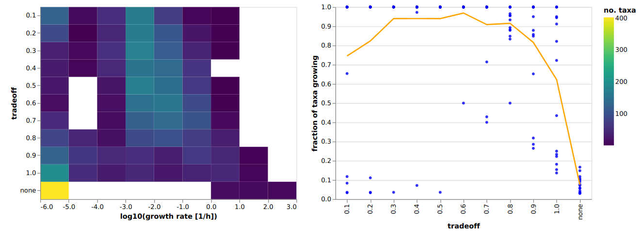
Choosing a tradeoff value
In the original MICOM publication we chose the tradeoff based on comparisons with in vivo replication rates derived from metagenome data. However, we observed that the highest correlation with replication rates is usually achieved at the largest tradeoff value that allows the majority of the taxa to grow. Thus, we can run cooperative tradeoff with varying tradeoff values and look for the characteristic elbow where the majority of the community can grow. This can be done by using the
plot_tradeoff function.
[2]:
from micom.viz import plot_tradeoff

pl = plot_tradeoff(tradeoff, filename="tradeoff.html")
The returned object is a Visualization object that contains the raw data in the data attribute.
[3]:
pl
[3]:
<micom.viz.core.Visualization at 0x7fe492ffce90>
[4]:
pl.data.keys()
[4]:
dict_keys(['tradeoff'])
You could open the visualization in your browser with pl.view(). Alternatively you can just open the generated HTML file which would give you something like this:
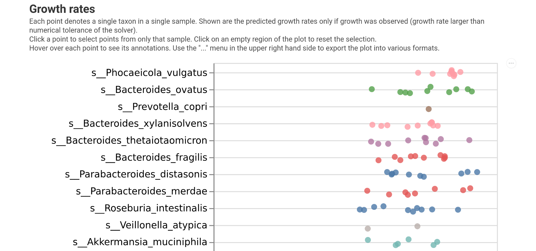
Plotting growth rates
The first thing we may want to investigate are the growth rates predicted by MICOM. This can be done with the plot_growth function.
[5]:
from micom.viz import plot_growth

pl = plot_growth(results, filename="growth_rates.html")
Which will give you the following:
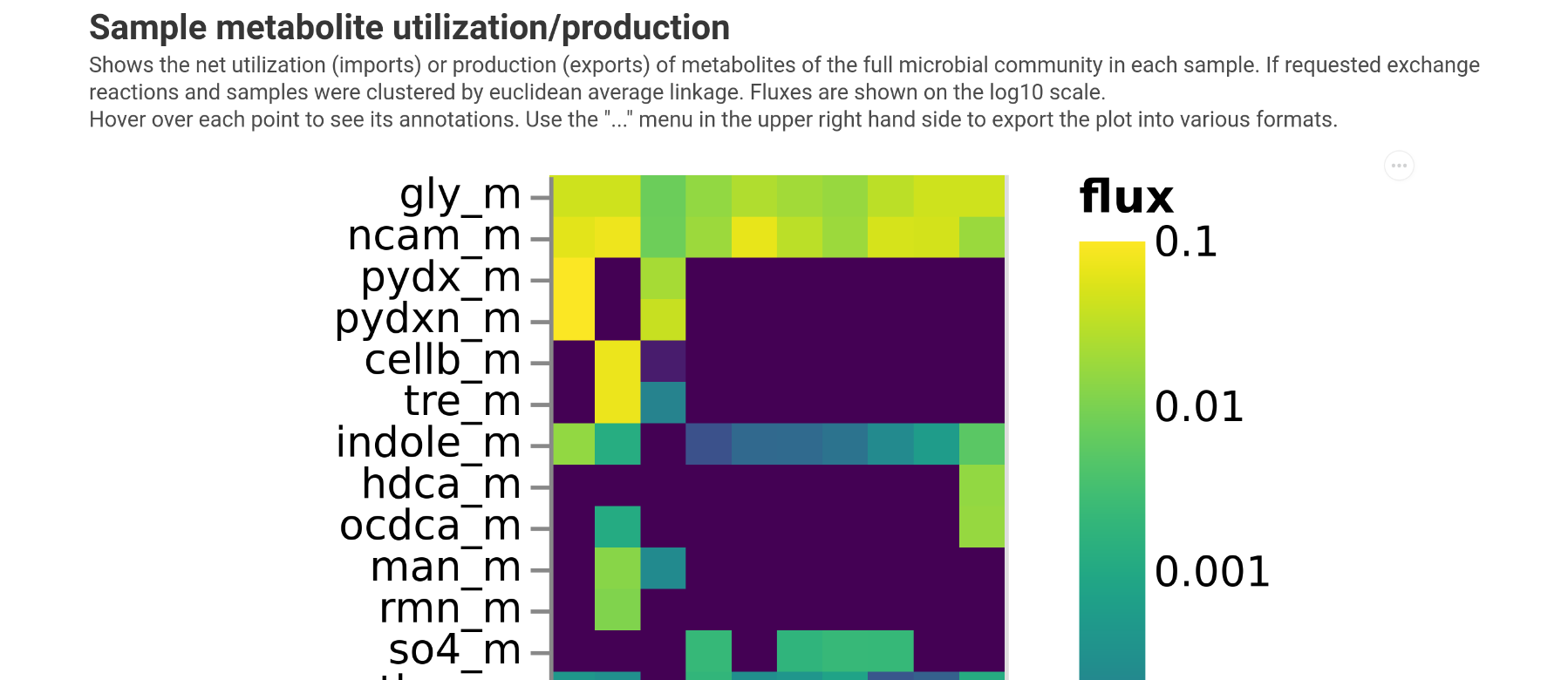
Plotting consumed metabolites
To get an overview which metabolites are consumed by the entire microbiota we can use the plot_exchanges_per_sample function.
[6]:
from micom.viz import plot_exchanges_per_sample

pl = plot_exchanges_per_sample(results, filename="consumption.html")
This will give you a heatmap showing all consumed components. Unless specified otherwise in the function arguments samples will be clustered so that samples with similar consumption profiles will be close.
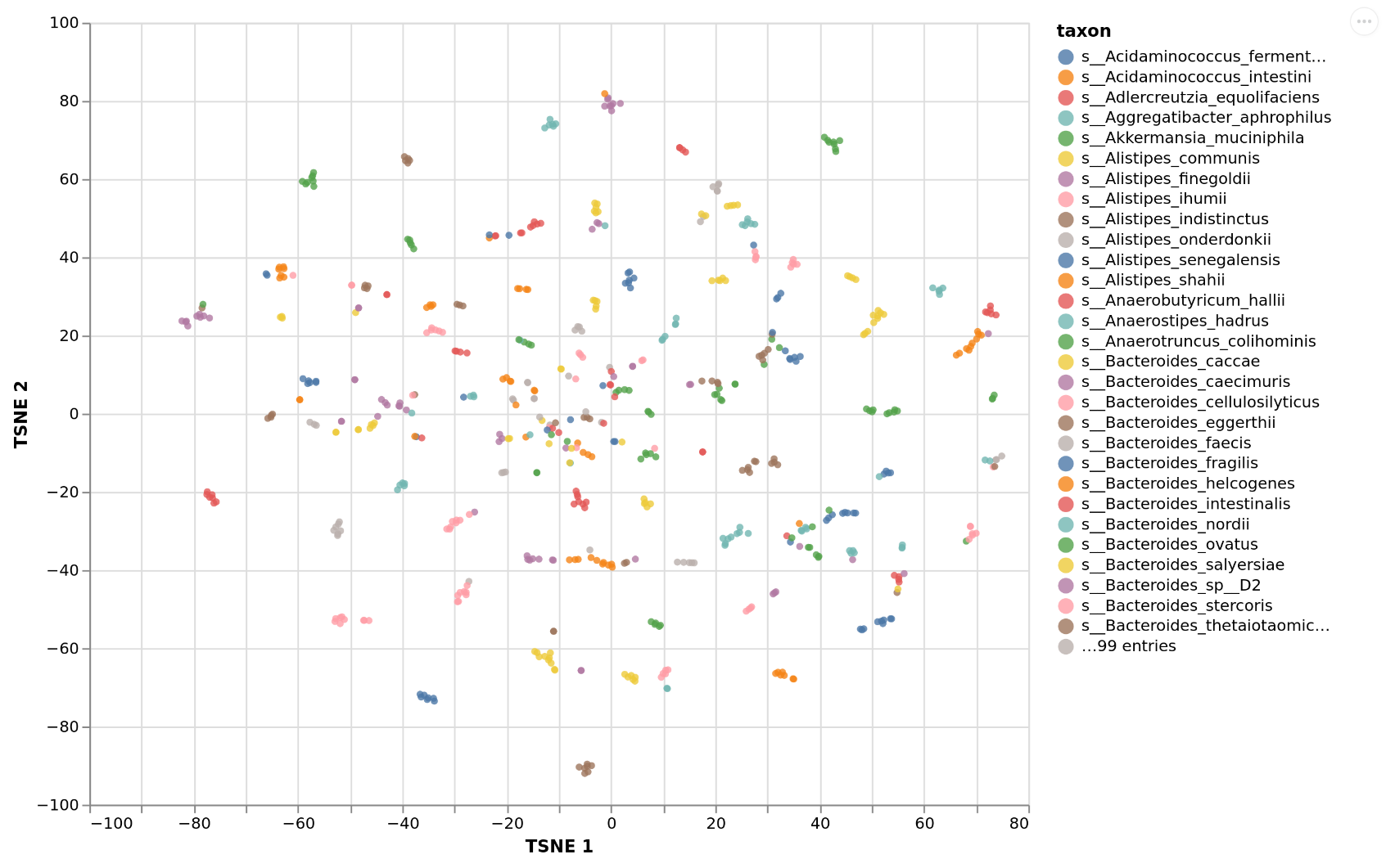
Plotting growth niches
What is consumed globally may be interesting but we may want to know even more how the available growth niches are occupied by the taxa in the sample. This can be done with plot_exchanges_per_taxon which will embed the import fluxes for each taxon into two dimension using TSNE and plot the niche occupation map. Here taxa that overlap compete for similar sets of resources. The center of the map denotes the most competitive niche whereas the outskirts of the map denote more specialized
consumption preferences.
[7]:
from micom.viz import plot_exchanges_per_taxon

pl = plot_exchanges_per_taxon(results, filename="niche.html")
[12:54:10] WARNING Not enough samples. Adjusting T-SNE perplexity to 5. exchanges.py:127
This will give you the following:
Investigating associations with a phenotype
Finally we may want to which fluxes relate to an observed phenotype. This can be done with the plot_association function which will:
calculate overall production or consumption fluxes (total metabolite amount produced by the microbiota)
run non-parametric tests for each metabolite against the phenotype
control the flase discovery rate and report significantly associated metabolite fluxes
log-transform and standardize production fluxes
train a LASSO regression (continuous response) or LASSO logistic regression (binary response)
present the overall performance of the fluxes inpredicting the phenotype
So you will get data on local (metabolite) and global (all fluxes) associations.
To illustrate this we will create a mock phenotype that is correlated with propionate production. We will allow very high q values here. In a real analysis the default of 0.05 is more appropriate,
[8]:
from micom.viz import plot_association
from micom.measures import production_rates
import numpy as np
import pandas as pd

prod = production_rates(results)
propionate = prod.loc[prod.metabolite == "ppa[e]", "flux"]
propionate.index = prod.sample_id.unique()
high_propionate = propionate > np.median(propionate)

pl = plot_association(
    results,
    phenotype=high_propionate,
    variable_type="binary",
    filename="association.html",
    fdr_threshold=0.5,
)
The output will look something like the following.
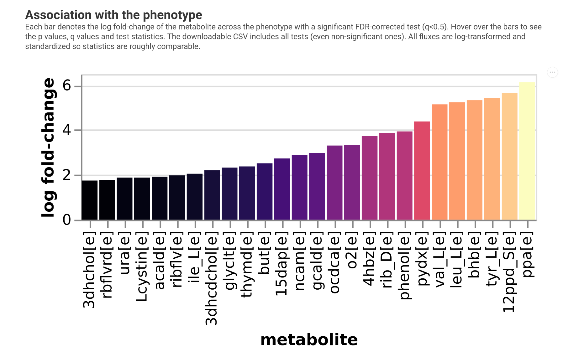
So we see we recovered propionate in the analysis but we would need larger sample sizes here.
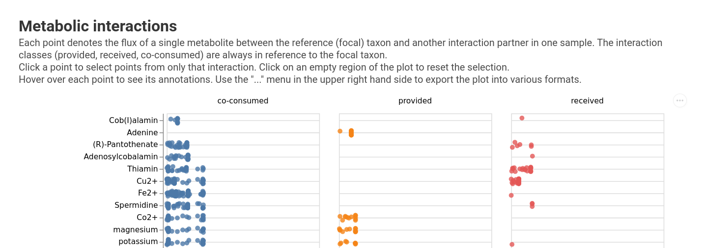
Plotting interactions
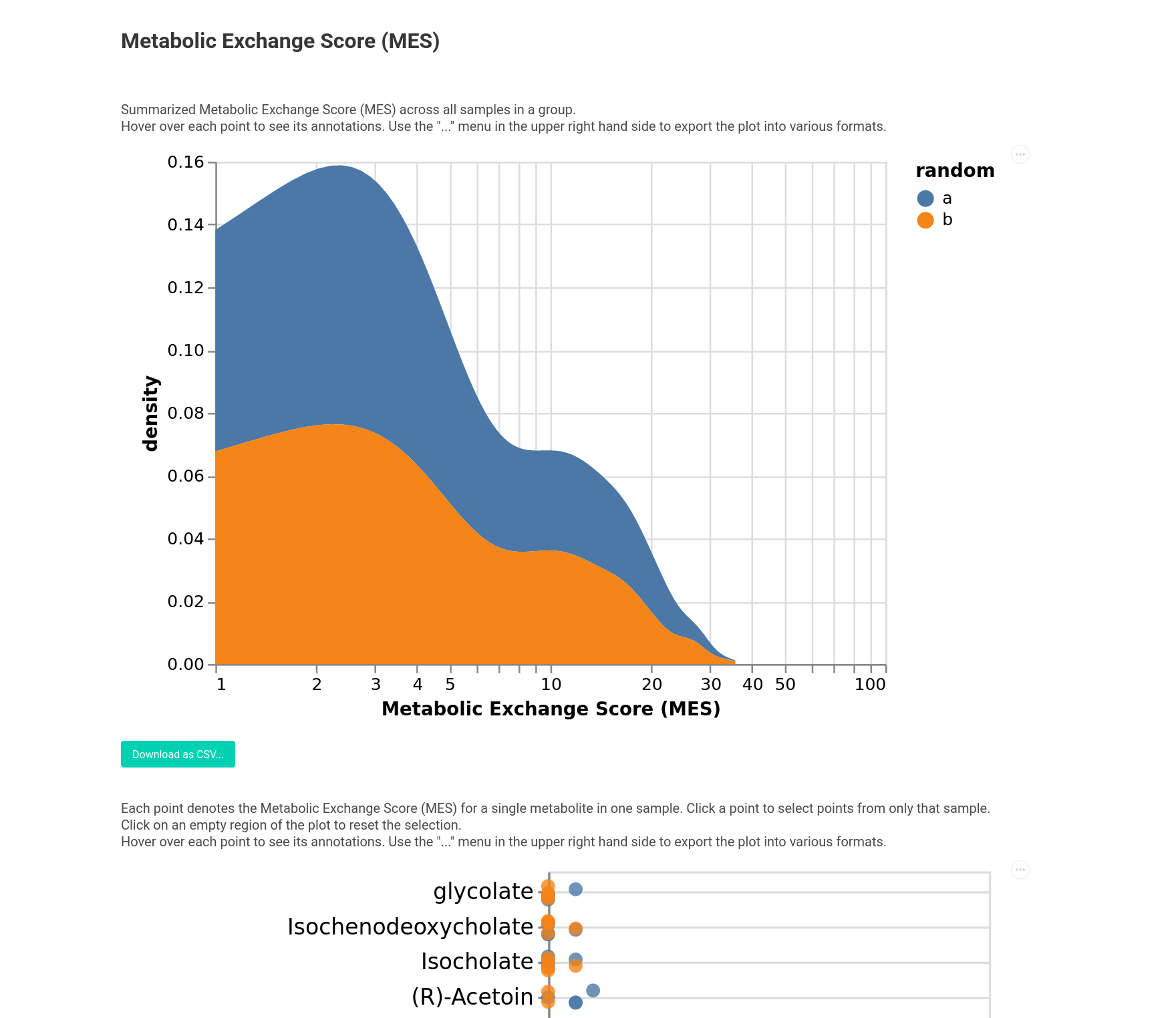
We provide support to plot focal interactions for a taxon of interest or the Metabolic Exchange Score (MES). For instance, let’s start by plotting the interactions for Akkermansia.
[9]:
from micom.viz import plot_focal_interactions

pl = plot_focal_interactions(results, taxon="s__Akkermansia_muciniphila")
You can choose many types of interaction fluxes by passing the kind argument. Currently supported options are:
“flux”: the raw flux
“mass”: the mass flux
“C”: the carbon flux
“N”: the nitrogen flux
This will give you a larger overview that looks like this:
Alternatively you can also visualize the Metabolic Exchange Scores. This can be done across different groups as well. To illustrate this let’s do this with some random groups.
[12]:
from micom.viz import plot_mes

groups = pd.Series(
    5 * ["a"] + 5 * ["b"],
    index=results.growth_rates.sample_id.unique(),
    name="random"
)

pl = plot_mes(results, groups=groups, filename="mes.html")
Here you see the MES for each metabolite and also a global overview across the groups.